Use formatting to add context to segment charts by enabling functions like data labels and multi-chart titles.
Aside from the common formatting functions, the following formatting options are available when working with segment charts: background color, explode, optimize visual and Arc Radius.
Segment Chart Formatting
Fill

- Background Color: Change the color of the Report Background using the Color Picker tool. This change does not affect the chart background.
Settings

- Explode: Add a division between segments in the chart.
- Optimize Visual: The visual optimization engine in Pyramid is a heuristic that automatically redacts certain parts of a graphical visualization based on the amount of space provided.
- Arc Radius: The Radius setting curves the corners of the slices at their outer edge to make them appear rounded. Where the Arc Radius is set as zero, the slices have angled corners where they meet. For any other radius value, the affected angles are curved to a greater or lesser degree depending on the given value.
Miniature
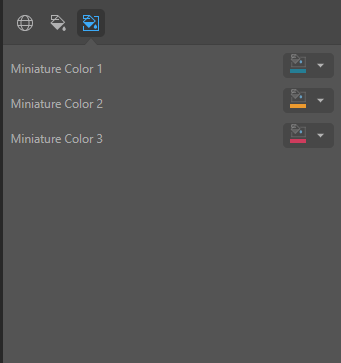
Click Miniature (purple arrow below) to specify the colors used for the text content when your visual is represented as a Miniature Visual:

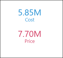
Miniature visuals are created automatically when you scale a visual down to a size that makes its content illegible. These tiles typically display the measure as a number with its name underneath:

Note: The purpose of a miniature visual is to provide a way to easily view and interpret important data at a glance, even where there is a lot of information and limited space.
You can use the Color Picker to set the text colors used when Miniatures are displayed in a visual:
- Miniature Color 1: Select the color for the first tile in the miniature visual (blue in the preceding example).
- Miniature Color 2: Select the color for the second tile in the miniature visual (red in the preceding example).
- Miniature Color 3: Select the color for the third tile in the miniature visual (not shown).